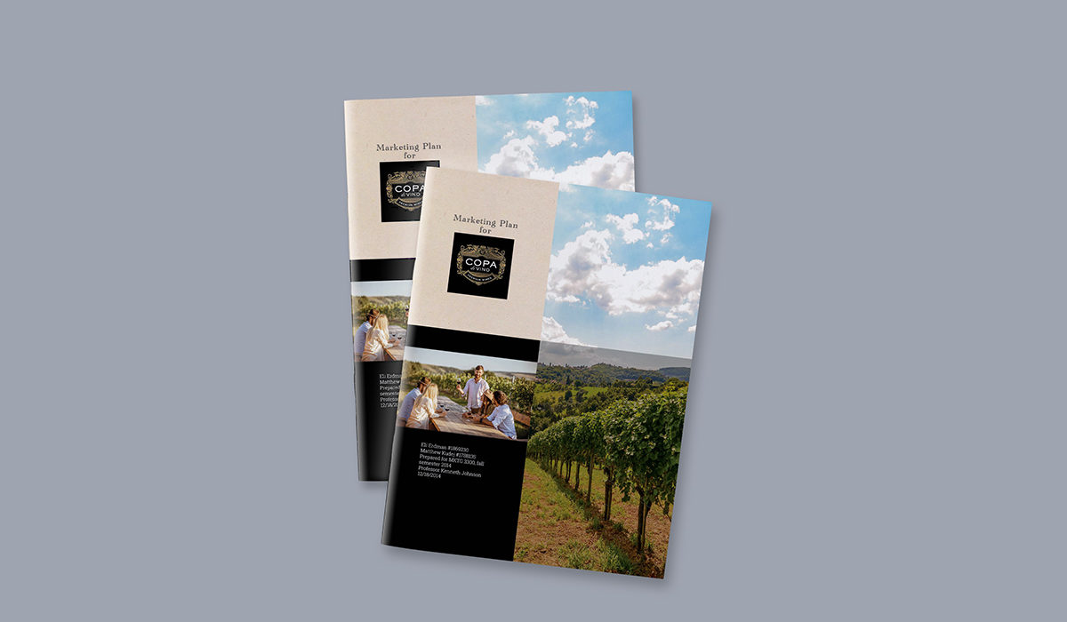
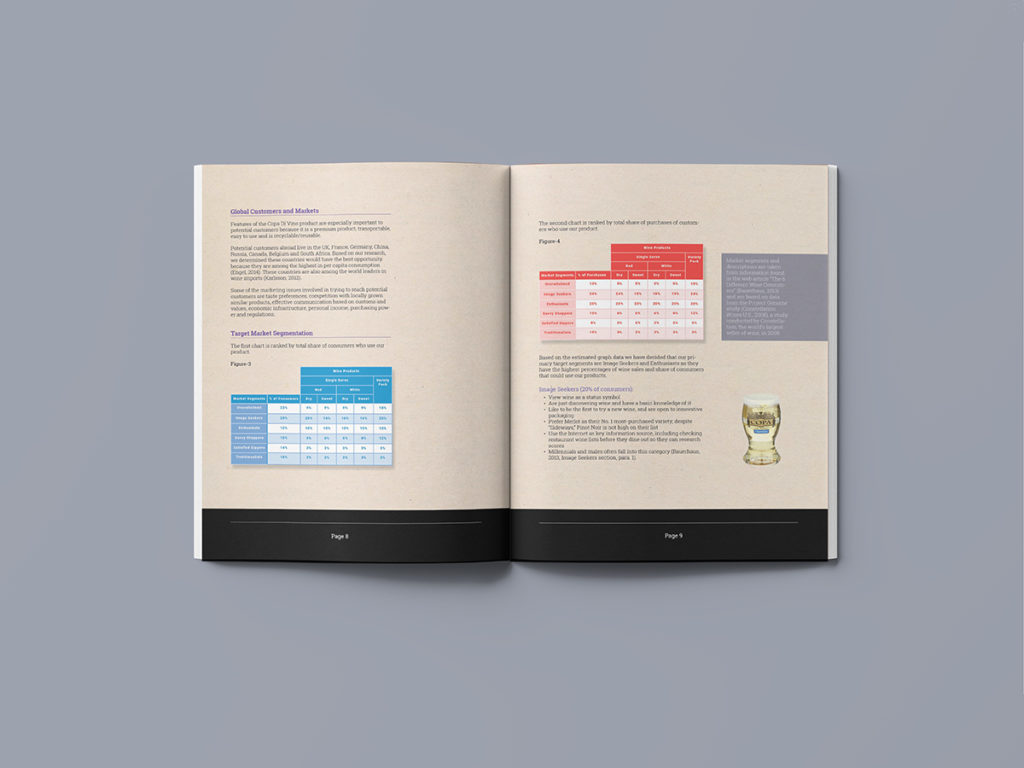
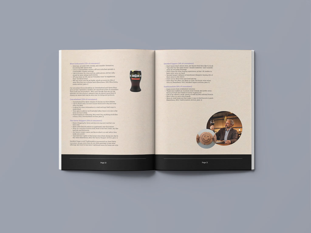
The design for our marketing plan takes its inspiration from Copa Di Vina wine seller. The report features a prominent use of photos to showcase the brand as well as to showcase their unique product packaging. It also uses simple graphs and tables to highlight the all important comparative data required by a marketing plan. Monochromatic color sets such as red, cyan, gold and purple, colors often associated with Copa products, are used as eye catches to draw readers attention to important information while background elements are grounded in earth tones. Black trim edges and gray callouts give the page a high class touch.
The report was written Eli Erdman and Matthew Kudej. Principles of Marketing. Instr. Kenneth Johnson. Crookston College. 2014

