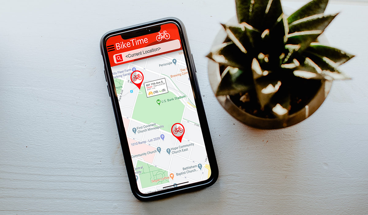
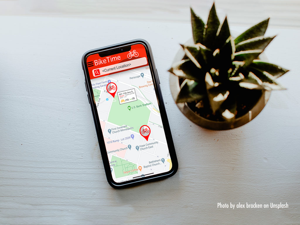
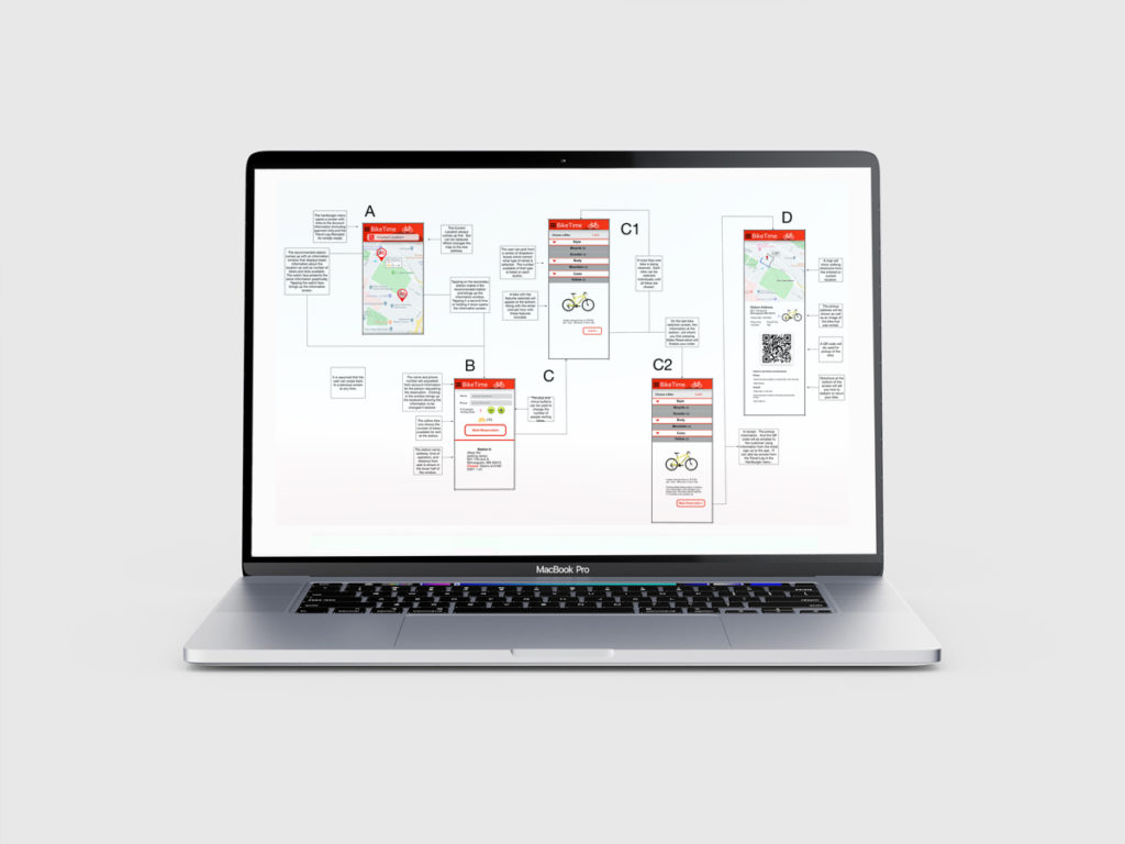
The Bike Time app was designed around the idea of a bike rental app and consumer feedback was solicited to determine best function and benefits. The bike/hill logo and the color red were chosen to show prominently and be distinct from competitors. The design of the apps interface was based on feedback elicited from participants. Use of maps, menus, search functions and RFID design were screened to arrive at the final design.


